Have you ever asked the question: “What are Pivot Tables?” Maybe you have heard about Pivot Tables, but still ask what are Pivot Tables used for? Sometimes when conducting a training session a student will say: “We don’t need Pivot Tables”. Then they might look at me with a sideways glance asking: “What are Pivot Tables anyway?”
Do I Need a Pivot Table?
I’ve tried to work out why people say they don’t need something when they don’t know what it is or what it can do. It’s like saying: “No we don’t need lights in our car, we have a perfectly good torch”.
In fact that illustration, which just popped into my head, is pretty accurate. It highlights a typical viewpoint of many users of Excel. That’s the “If it ain’t broke don’t fix it” point of view. Maybe, with Excel, many would say say: “I hope I don’t break it!”. They’re just happy enough to get the figures accurate. Happy that the formulas are doing the job, so why would they mess with them.
So then someone like me enters the arena. A lot of students present me with their Excel sheets that they have worked on for ages. Sometimes even 3 or 4 years. Included in their spreadsheet are formulas they have developed and are extremely proud of. Perhaps they have added a summary sheet, on which they have particularly worked hard on. I can see the faces of some beam with pride as they parade their formulaic prowess with a sense of satisfaction. The problem they now face is one of inflexibility.
What’s the Problem of Not Using a Pivot Table?
It’s true that the formulas they have created may be impressive. They may have toiled through many nights perfecting those calculations. However, because the structure of their spreadsheet is designed to answer a specific problem. It makes it difficult to rearrange the summary sheet to provide solutions for other analysis issues. I think it would be be clearer if we looked at an example.
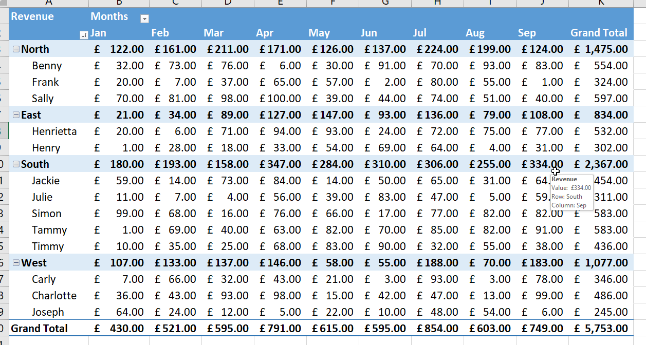
When you look at the above Excel, matrix, style spreadsheet all looks well. The dates are across the top as column headers, and the different sales areas are displayed on the left. Below the matrix you can see the totals all neatly summarised. In this above example you could get away with using SUM because there’s no chance of having a duplicate area. In other words, you wouldn’t place North in twice. If this is all the information you need then this would be fine. But, thinking about the future, there are some problems such as:
- Adding extra months
- Grouping Teams within areas
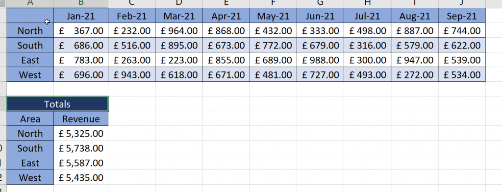
OK! Let’s look at another example.
Now our spreadsheet just got a whole lot more complicated. You can see we have subheadings, to each of which we have had to apply =SUM() functions.
What are Pivot Tables Good For?
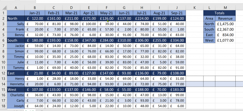
Now imagine this data is changing constantly. Maybe on a daily basis. This means that everyday you are going to have to go into this spreadsheet and update all the formulas. Plus, because the North, South, East and West areas may be on different rows, you’re going to have to do something more than a simple sum function. What you’ll need to do is either multiple =SUMIF() functions. Alternatively, you could do something similar to what I did in cells M3-M6.
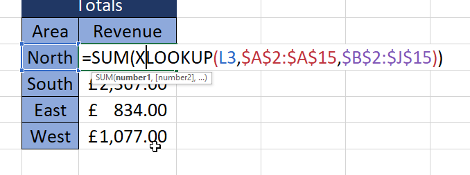
Just looking at the above formula is enough to give you a headache. Also, the knowledge that you might have to edit this formula each time the data is updated, maybe with North-East, North-West could cause you to abandon this spreadsheet. I mean, the potential for errors is considerable.
Are Pivot Tables the Cure?
Alright then, you might say, this spreadsheet looks good. In fact it might look better than some of the formulas I already use. What is the correct way to store data so that it can be easily analysed.
OK let’s have a look at this data structure in a way so that it can be used with a Pivot Table.
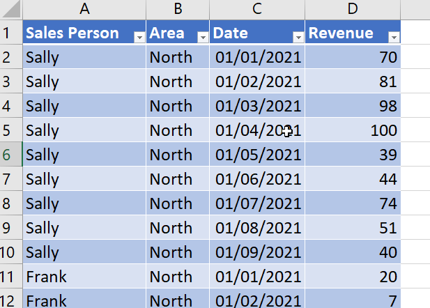
So this doesn’t look all that pretty and maybe entering data in this way isn’t the most intuitive. However, this is how data should be structured so that you can analyse it.
By the way if you’re wondering how I got the data to look like this I used Power Query. I used the following steps:
- Converted Data to Table (Ctrl & T).
- Data – Load Query from Table/Sheet.
- Promoted Headers.
- Renamed the first column to Sales Person.
- Added a Conditional Column looking for North, South, East and West.
- Renamed the Conditional Column to Area.
- Filled Down (Transform – Fill – Down).
- Filtered out the North, South, East and West from the recently renamed Sales Person Column.
- Selected the Sales Person and the Area column and Unpivoted Other Columns.
- Changed the various data types.
- Closed and Loaded into a Table on a new sheet within the same workbook.
Power Query is a fantastic data manipulation tool and something well worth looking at.
How to Change this data into a Pivot Table?
So now you might be wondering how to change the raw data above into a Pivot Table? You would be forgiven for saying that it looked better before. So here’s how:
- Click on the Table and in the Table Design Tab choose Summarize with Pivot Table.
- Click OK. (That’s the Pivot Table created).
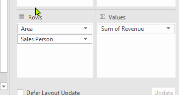
- Drag Revenue into Values then Area and Sales Persons into Rows in that order.
Your Pivot Table is now created. You need to change the formatting of the numbers, colours and other things to make it look pretty. But the beauty of this is that all you need to do is update the data on the other sheet. Then right click on the Pivot Table and choose Refresh and the Pivot Table updates. You haven’t had to write any complicated formulas, you don’t have to double check mistakes. In fact very quickly you can get your Pivot Table looking like:
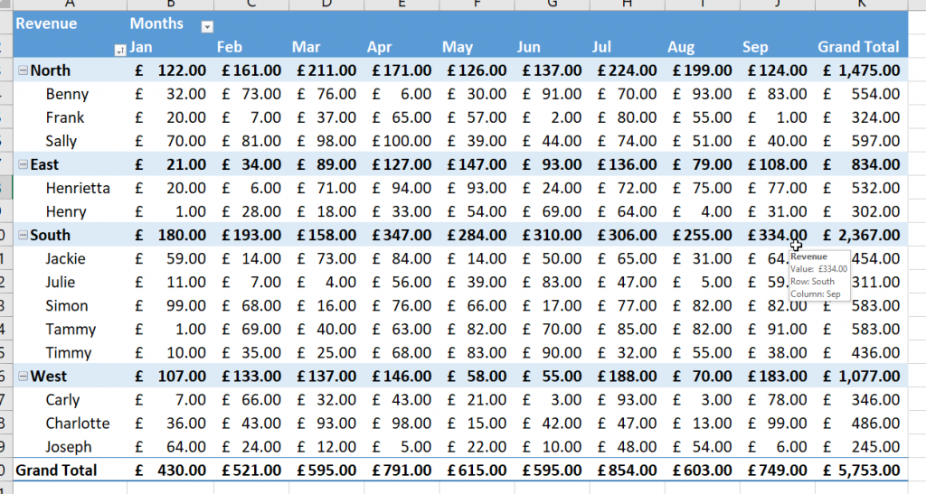
So, who says you can’t get Pivot Tables looking as you want them to.
If you want to know more about formatting Pivot Tables then please check out this Pivot Table training guide which will take you step by step.
Also, this YouTube Pivot Table training video is also a fantastic resource.
Finally, I’ve taken the liberty of including the data file I used to create this blog and you download it here. Be aware that include Power Query to convert the data into a format that we can use.